Executive summary
I plotted the Czech time series data by month of vaccination.
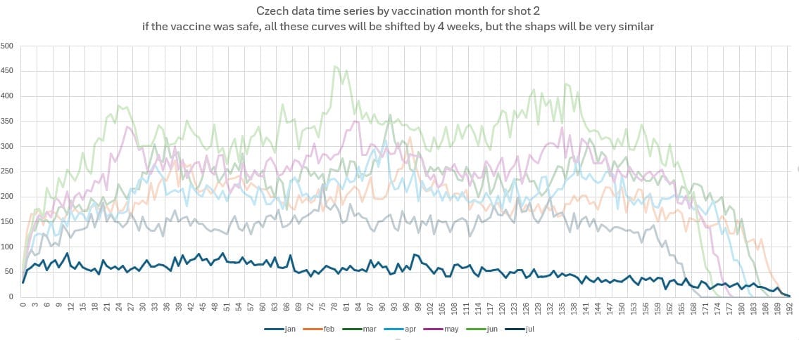
If the vaccines were safe, these would all be left shifted versions of the same shape.
They aren’t.
There is no known explanation for that other than the vaccines weren’t safe.
Here’s the confirmation.
What’s a time series?
It’s a plot of the deaths per week against time since the shot was given. In my case, shot #2 in the Czech Republic.
For a safe vaccine, the slope is a relatively flat line, with some seasonal peaks. The slope depends on the average age of the people dying and will be negative if over 86 years old, neutral around 85, and slightly sloping up for fixed cohorts with a younger average age of death. For example, young cohorts will have a 5% increase in weekly deaths by the end of the year, so halfway through the year, the deaths will only be a little higher, nothing noticeable.
What does the Czech data show
It shows all the world’s health officials were wrong.
Not only that, it shows when we expose that they were wrong, they will still refuse to admit it.
That is why they keep the data hidden from view.
Here is the dose 2 time series for everyone in the Czech Republic.
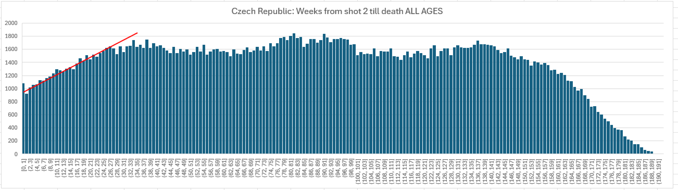
That’s all you need to show the shots were unsafe. A 60% increase in 6 months in baseline mortality which should be flat from the baseline set at the start of the chart (skip 3 weeks for HVE (healthy vaccinee effect) to vanish).
There is no way to explain or debunk this despite a feeble attempt from “Uncle John Returns” who just exposes how inept he is.
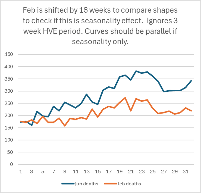
This is NOT seasonality. Seasonality repeats every 365 days.
This not 6 month HVE. HVE lasts 21 days tops and is a zero sum game. The death curves (like the 4 booster curves in KCORv2) show no leaving of deaths in the dose 2 group when dose 4 rolls out:
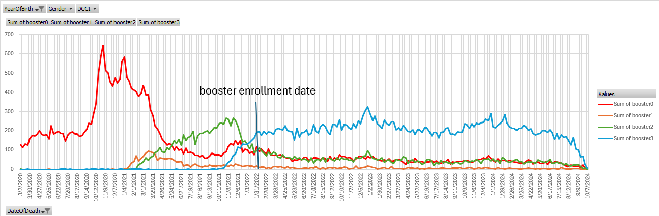
And my “Under 80” curves in KCOR show clearly this is not HVE since curves diverge post booster in the same cohort. See the spreadsheets in my Github: skirsch/Czech/analysis.
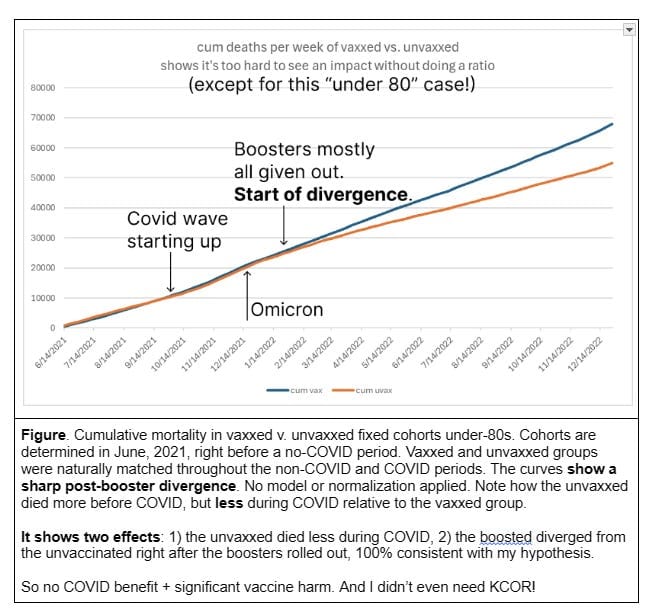
But someone will claim, “Oh, that’s just showing background mortality since most people were vaccinated in a narrow time window. It’s seasonality!”
So that’s easy to falsify. You do the same plot for each month of vaccination, starting with Jan. If the shot are safe, like they appear to be in Jan, then each curve is a left shifted version of the previous curve (with height differences since different # of people got shot each month).
Jan:
Feb:
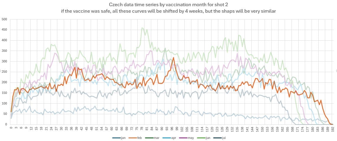
March:
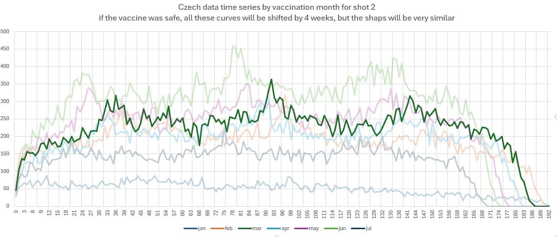
April:
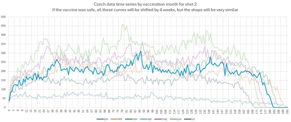
May:
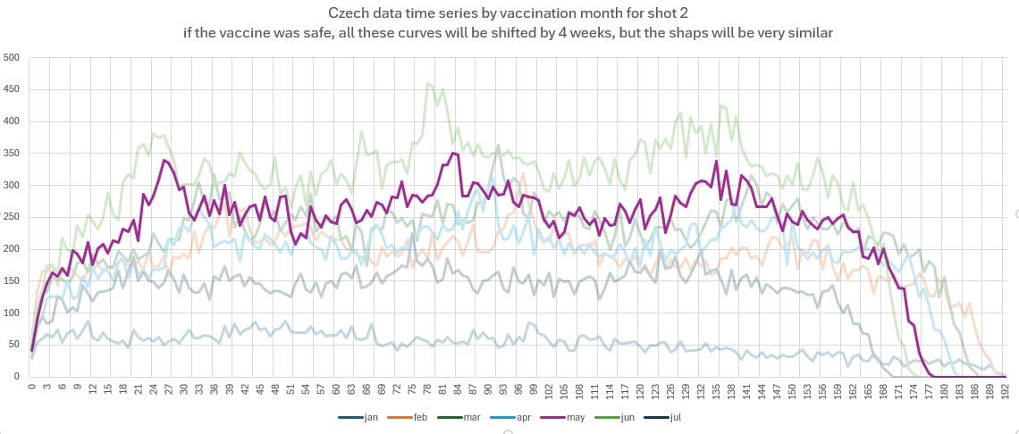
Jun:
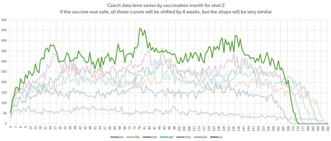
July:
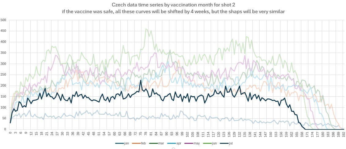
Here are the time series curves shifted to overlap to show the shapes, which should be identical (since the starting point is the same in the same month) are NOT identical. Vaxxed more recently grow faster over time than vaxxed earlier. This is NOT seasonality (that ONLY has impact in a NARROW region of weeks).
And seasonality affects OLDER people most. Yet the oldest cohort was vaxxed in Jan and there was no seasonality!! The youngest were vaxxed in June, and there is a huge mortality increase.
So these “explanations” are just attempts to gaslight you. That’s why they are always from anonymous sources.
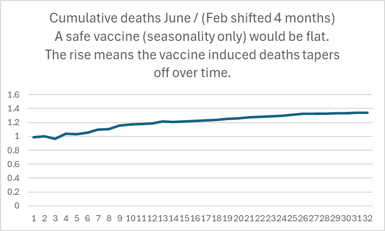
Here’s the ratio of the curves. This means the kill effect was stronger soon after the shots and started wearing off. A safe vaccine would have a constant ratio:
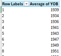
Average YOB for shots given in each month (74 years old in June):
Summary
There isn’t any way to rationalize this data other than the shots were deadly.
Sadly, no health authority will ever admit they were wrong. Instead, they will pursue criminal prosecutions against people who try to make the data public, like Barry Young. The New Zealand data revealed the same pattern of harm.
They will continue to ignore their own data. It was very easy to do this analysis.
New book by Etienne de la Boetie2 exposes that the government and Hollywood have been running a multi-generational, trillion-dollar psychological operation on the population to indoctrinate them into accepting a ruling class, confiscatory taxation, and inflationary fractional reserve currency issued by private banks.
The book details 25 unethically manipulative techniques the “government” and monopoly media have been secretly using on the population, ranging from a hidden curriculum in their mandatory schools and scouting to the secret placement of propaganda in over 1,000+ movies and 1,000+ television shows. These techniques include subliminal messages and product placement of the American flag “anchored” to moments of high-positive emotion during the “programming”.
See the Press Release with more details HERE.
Buy the book at SeeTheCage.com
Substack readers can get the book for FREE by “Going Paid” to ANY of the Art of Liberty Foundation’s four Substacks AND get access to all four of those Substacks! Simply “Go Paid” and we will reply with details.